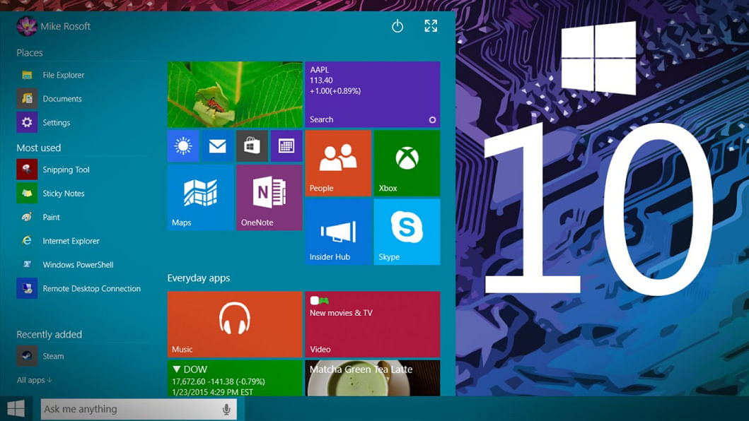
Windows 10: First Impressions

For the past one year, we've been keeping track of Windows 10 and every little feature they introduced with each new update of the beta. But at the end of the day, it was still buggy and unstable. We're glad that that phase is over as Microsoft rolled out the consumer version of their new operating system on 29th July. We tried it out and here's our first impression on Windows 10.
We've been reading about how Windows 10 booted faster that 8.1 or 7 and turns out all those Internet people weren't bluffing. My computer went from a clean boot to fully up and running in 6 seconds. That's almost half of what Win7 used to take.
First up, the Start Menu's back and that's one of the sensible changes Microsoft made. It looks beautiful. You've got the metro apps on the right and all the usual options on the left. You can change the orientation of the apps and configure the size of the start menu by simply clicking and dragging. One other change we really like is a list of all the apps we added recently or use most.
Right beside the Start icon is Cortana. This is one of the biggest features on Windows 10 and it works flawlessly. Cortana was easy to set up and it pulled up a few burger places in the area and ironically showed a news article from Verge regarding Windows 10. Plus the football match schedules were on point and reminded us of Chelsea's next game.
What makes Cortana's interface so interesting is that, you can search for anything on the web or on your PC. While on Windows 8, we had to drag the mouse to the corner of the screen, wait a few micro seconds for a window to pop out and then search for an app or something, here in Windows 10- we have that option always on the taskbar on the desktop without any extra hassle. The search engine is set to Bing by default but you can change it to Google through Settings.
What sets Cortana apart from Siri and Google Now is that, now you can see what it knows about you and select individual options to help it provide you with the information you need. For example, you can select your favorite cuisine or your favorite football team or even what particular topics you're interested in the news section.
Then there's the Action Center which gives a modern desktop experience by giving out real time notifications about reminders, new mail and everything. Personally, I would have liked it better if Cortana and Action Center was merged together but what we have now isn't bad either.
But for someone who has a lot of windows and different apps open at the same time and is constantly multitasking, the biggest attraction will be Task View. This makes virtual desktops very easy to navigate through and control. You click on the small white icon and instantly get an organised card style view of all your open windows. At the bottom right you've got a plus sign captioned New Desktop. You can drag any window you want to that and see them clutter up on different desktops- all of which are viewed as thumbnails on a bar at the bottom.
The split screen multitasking view is on point too. You can drag a window on either the left or the right side and it will automatically snap into position to take half of the screen, while on the other half you will see an option to choose another running app to take up the rest of the space. If you drag a window to any one of the four corners it'll take up quarter of the screen instead of half and with that you can work on four at the same time. This definitely adds to the sweet experience Windows 10 is turning out to be.
This review would be incomplete if we didn't bring up the new browser, Microsoft Edge. While it's nothing out of the ordinary, it is without a doubt a huge improvement from those dark Internet Explorer days. Mind you, IE still exists as an app in Windows 10 because a few sites prompt you for Internet Explorer for certain pop-ups or options.
But Edge reminds me of Apple's Safari because it's so easy to use and visually pleasing. We loved the small icon labeled "Hub" that pops out a tab from the right side and we can see bookmarks, downloaded files and stuff on the reading list. Ah yes, the reading list is another laudable feature of Edge that Chrome still doesn't have. We also found the option to scribble anywhere on a page and share it instantly on social media or through mail, very useful.
Speaking of mail, Microsoft made their default metro apps better than ever. Mail and Calendar have become two apps that you'll find yourself using a lot on Windows 10.
There are however a few new changes on Windows 10 that some might disagree that aren't exactly features and more of an extra burden. Such as automatic updates that you can't turn off but can control or the constant prompts to connect your Microsoft account for getting a "better experience". But these are arguably minor problems doesn't turn out to be much of an issue.
This is more or less everything we thought about the new Windows 10 and our verdict is that you should most certainly upgrade.

 For all latest news, follow The Daily Star's Google News channel.


Comments