VIVO V17 Pro
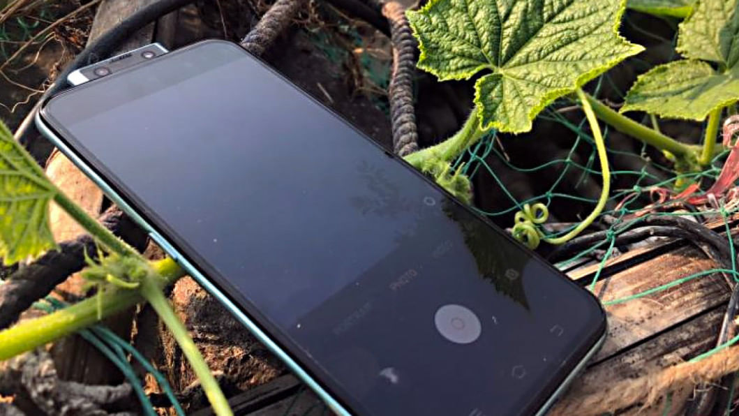
Vivo's latest phone the V17 Pro comes out 6 months after the release of the V15 Pro. The successor to the successful V15 Pro pulls out all the stops in the camera department, quietly making a category for itself in the smartphone game. Unlike the OnePlus 7 or K20 Pro, which are approximately BDT 10,000/- more than the V17 Pro, Vivo's answer to this corner of the market is similar to how Google approached the flagship game – killer cameras. Suffice to say, the Vivo V17 Pro's quad-camera and dual front-facing pop-up cameras excels at its jobs and the pictures really speak for themselves. This makes the V17 Pro a good choice for people who want to dabble in mobile photography and other camera hijinks. After spending nearly a month with the phone, from fighting with the not so fun parts of the OS and everything else good in between, it's time I get into the crux of things.
Build
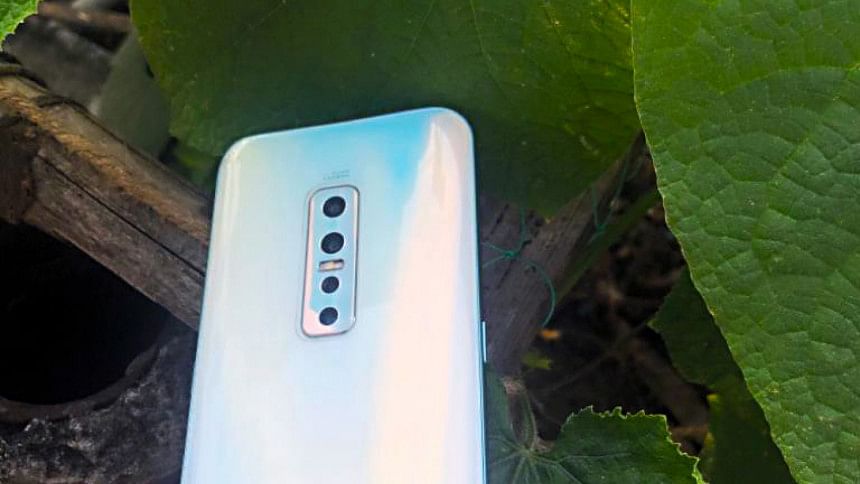
First off, the phone is covered by Corning Gorilla Glass 6, front and back. There is a plastic frame on the back, basically meaning that the phone does not have wireless charging. The V17 Pro features quaint choices of colours for the back glass – Crystal Black and Crystal Blue; the former being a subdued shade of navy blue while the latter (the model I had) was modeled after a fluorescent shade of aqua or the lightest shade of blue you can think of.
Screen
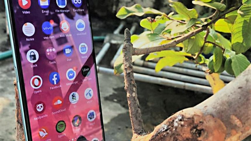
The 6.44-inch Super AMOLED display works well in almost all lighting conditions and this is where the first signs off good AI come into play. The adaptive brightness is quick and responsive, responding on the go to all lighting settings. And while I enjoyed my time with the phone, viewing content, surfing the web, there was a clear reflective quality to the display. While it was by no means a hindrance, it is just one of the quirks that I happened to notice. The V17 Pro comes with an under-display fingerprint sensor and it was smooth and receptive to touch. There is an animation time that happens when the phone unlocks but it is hardly noticeable.
Camera
The first thing that springs into mind is the dual front-facing camera. A 32-megapixel and an 8-megapixel ultra-wide lens make up the front. While there is an air around the overkill factor of this design if you're getting good selfies then who's to complain. But if you're like me and you don't like what these Chinese phones are up to with beauty mode, then it's okay to be on the fence because the V17 Pro, even with all the beauty mode settings turned to zero, produce selfies which have some additive AI work going on in the background. Nevertheless, the front-facing cameras really do a good job, producing social media-ready pictures and having wide-angle makes the Vivo V17 Pro a good choice for parties.
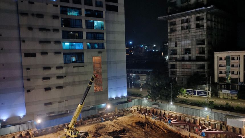

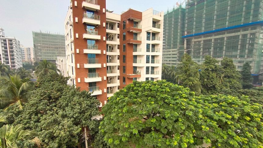
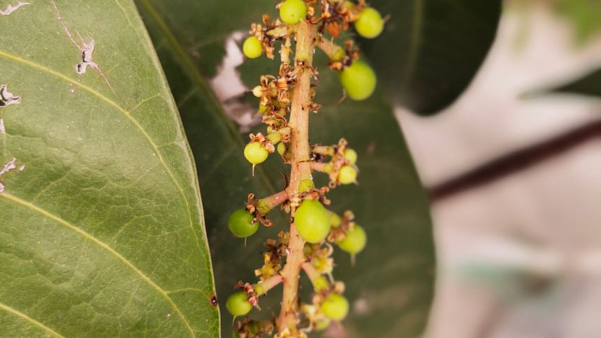
The quad-camera setup produce some of the best pictures you can get within this price range. The pictures taken with the phone don't have the visible over-sharpening and saturating that you would find on other phones in this category but it does come with some caveats. The main sensor is a 48-megapixel wide lens which is accompanied by an 8-megapixel ultra-wide lens, 13-megapixel telephoto lens, and a 2-megapixel depth sensor. The camera UI is snappy too, letting you switch from ultra-wide to bokeh to super macro shots all with one or two taps. The pictures come out looking great too, with natural light and feel not being an issue with the back cameras. While, pictures in ultra-wide have grains and AI sharpening involved, and the bokeh effect has some over smoothening issues along the edges, it can be chalked up to either the V17 Pro punching above its weight or under, depending on how you want to look at it.
Performance
Powering everything is the Snapdragon 675 chipset, which going by the 40k price point is terribly underpowered. And while apps ran smoothly, multitasking wasn't tedious and PUBG ran on high settings, the phone lagged at times, chugging when too many things were thrown at it. And if you've used the K20 Pro, One Plus 7s, Realme XT, Oppo Reno 2 or anything in the same ballpark then you will feel the rigidness of the V17 Pro's hardware performance. It's by no means egregious and you can do a lot worse in terms of the spec-spread.
Funtouch OS and bloatware
Funtouch OS and bloatware really takes this phone down a notch in terms of overall likeability. The easiest way to explain it is that the UI is an Android-iOS hybrid with the bulk of the functionalities available in a slide up tray. There is a slide down tray similar to what you'd find on Android but it houses only the notifications, Jovi and a scanner. Receiving calls was confusing the first time too, requiring you to move a circle top or bottom. There's also a bunch of bloatware apps on the phone but by the time you're done figuring out the UI, you won't notice V-Appstore, i Theme, vivo.com, vivoCloud, EasyShare, etc. It wasn't all bad and I was used to the UI in a couple of days. The iOS style bottom drawer/slide up tray actually grew on me and made accessing tiny apps like calculator, flashlight and split screen easy.
SPECS
Processor: Snapdragon 675 (11 nm)
GPU: Adreno 612
OS: Android 9.0 (Pie); Funtouch 9.1
Rear Camera: 48 MP f/1.8 (wide), 8 MP f/2.2 (ultrawide), 13 MP (telephoto) and 2 MP f/2.4
Front Camera: Motorized pop-up 32 MP f/2.0 (wide) and 8 MP (ultrawide)
Display: 6.44-inch, Super AMOLED 2400 x 1080 pixels
Memory: 8GB RAM
Storage: 128GB internal memory
Battery: 4100mAH lithium-ion
Price: BDT 39,990/-
Verdict
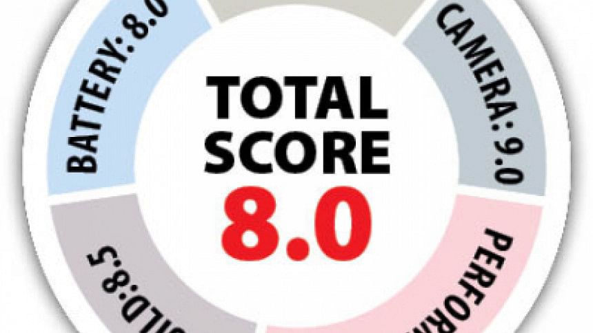
An 8GB/128GB vivo V17 Pro will cost you a smooth 40k and if there are any stand out features then it would have to be the dual selfie cameras. As it stands, the Redmi K20 Pro has a better main camera, beating the V17 Pro's 48-megapixel with its 64-megapixel lens. And both the K20 Pro and OnePlus 7s have it beat in terms of hardware, but not for price. So if you want to make hard sacrifices in the hardware and UI department while having a good main camera setup and a great selfie setup, then the V17 Pro has got you covered.


Comments