Features

UX design myths debunked
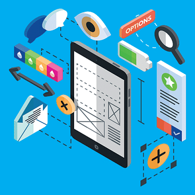
User experience or UX design is underestimated when it comes to building a digital product. People mistake it as interface design and end up ignoring the fact that just because something looks good doesn't mean it works that well. If your users are facing issues, that neat stock image and the flashy text effect isn't enough. But the industry is constantly changing and trends that might have worked a few years ago can easily become useless. Here are a few common UX design myths that we need to let go of.

Single-page accessibility

UX designers get caught up in simplifying the process by trying to cut down the number of screens you have to interact with. Thing is, by adding a few extra screens that ask for small inputs one at a time, you take away your user's frustration with having to put in a lot of information at once on a single page. The process is broken down and it feels simpler than having to fill out a form. For example, while signing in to Google services, you have to enter your username first and then your password on a second page as opposed to typing in both together. The key is to not make your users feel overwhelmed by asking a lot of things simultaneously.

Visitors HAVE to sign up

Having a lot of users register for your service when you're starting out seems rather exciting. But if your target customers aren't coming back to your site then the account they created to learn more about you is redundant. Which is why it's important to let your first-time visitors use your product or service or at least certain features of it before asking them to sign up or commit to a plan. You make sure the users who opened an account did so because they liked what you're offering and not because they were forced into it.

Functionality is everything

Yes, we've all heard things like: "Design is not just about how it looks, it's about how it works". But at the end of the day, having an amazing concept is not enough if it looks and feels like crap. You might have taken a 10-year old, cluttered site and simplified it, but there's a lot more to user experience design than just a cleaner approach. Your colour scheme, fonts, visual elements and interactions are equally important in a creating a better digital footprint.

Users don't scroll

Scrolling was less preferred when almost everyone around us didn't have a smartphone. Now that the circumstances have changed, trying to cram important information above the fold is a primitive strategy. Building sites which expect visitors to scroll down to discover specific call-to-action buttons or beautiful product descriptions give you a lot of space to strategically place your content and be generous on the visual side.

Hidden menus

If you have a menu that's hiding more than 3-5 clickables, then you're failing to understand your user's priorities. Hamburger menus are confusing because your visitors don't know what to expect. Will I get what I'm looking for if I click on those three lines? Why do I have to work harder for reaching something I want? If your users are willing to make the effort to go to a hidden menu for a feature, it should be right in front of them.

Comments

সচিবালয়ে আগুন, নিয়ন্ত্রণে ১৮ ইউনিট

সচিবালয়ে মধ্যরাতে অগ্নিকাণ্ড ঘটেছে। আগুন নিয়ন্ত্রণে ফায়ার সার্ভিসের ১৮টি ইউনিট কাজ করছে।

৫ ঘণ্টা আগে