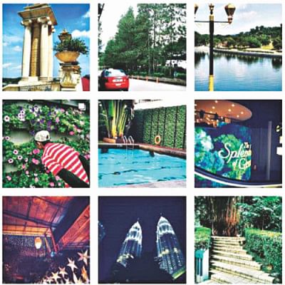
Guide to an Aesthetic Feed on Instagram

There are three types of people, the ones who strive for perfection, the inbetweeners and the ones who don't care at all. If you fall in the latter category in Instagram and your feed is a brain dump, this is a good position to stop reading.
1. Identify your subjects
Are you passionate traveller whose exotic photos induce wanderlust? Are you an aspiring baker who never forgets to capture your newest delicacy? Are you an avid fashionista whose favourite hashtag is #ootd? No matter what you are, identify what kind of photos you mostly take and thus set your style rule. For me, it's a whole lot of greenery with a dash of architectural elements and a pinch of yours truly.
2. Taking the photos
Whether you're using a DSLR or good ol' Android, one rule of thumb for taking photos is to take them in natural light. This enhances details and ensures that your photo captures true colours. It also makes creating your preferred theme much easier. Experiment with various angles, backgrounds and arrangements for that one perfect shot. Don't forget, the crop tool is always there to fine-tune further.
3. Set the mood
To maintain a consistent look, a theme must be the dominant aspect of your feed. Consider whether you prefer bright and colourful, or dark and moody. This ultimately plays a huge role in deciding your subjects. If you want things to be light, your photos might feature white backgrounds and pastel colours. Similarly, a moody theme might include plant-based background and lots of black clothes.
4. Get editing
The key to maintaining a theme is to have a favourite filter and a specific editing process. There are tons of editing apps to choose from. It's best to play around with a few before zeroing on the perfect one. Popular options include VSCO, A Colour Story, Preview and Snapseed.
Don't go too heavy on the edits, though. Find a few filters that match your aesthetic and make sure they can be applied to most of your photos, since the goal is to preserve the uniform look. However, a true editing process requires you to go back and forth among multiple apps for different purposes. Snapseed is great for brightening the whites and adjusting the perspective, but not very suitable for applying filters.
5. Plan the arrangement
Sometimes two photos might look amazing individually but may turn out to be an eye sore next to each other. Apps like Preview help you to craft your feed since it displays your photos in the same 3-in-a-row pattern like Instagram. It's best to pair a busy photo with one that has negative space to make it easy on the eye. Avoid having warm and cool tones next to each other; edit them for an even tone.
When you're travelling, don't let the theme limit yourself from posting beautiful sceneries. If they blend into your feed: super. Otherwise, arrange your travel photos into grids of 9 or 12. This tip is also useful when you're looking to change up your theme.
Just like the word "groovy" in the '70s, and "wicked" in the '90s, it's safe to say the term "aesthetic" is the word of the mid 2010s. So be it.
Mashiyat Nayeem has a genuine phobia of onions and has mastered the art of scavenging for beresta in her biryani. Learn more at [email protected]

 For all latest news, follow The Daily Star's Google News channel.


Comments