Interior Design Tips

Light colors for smaller rooms:
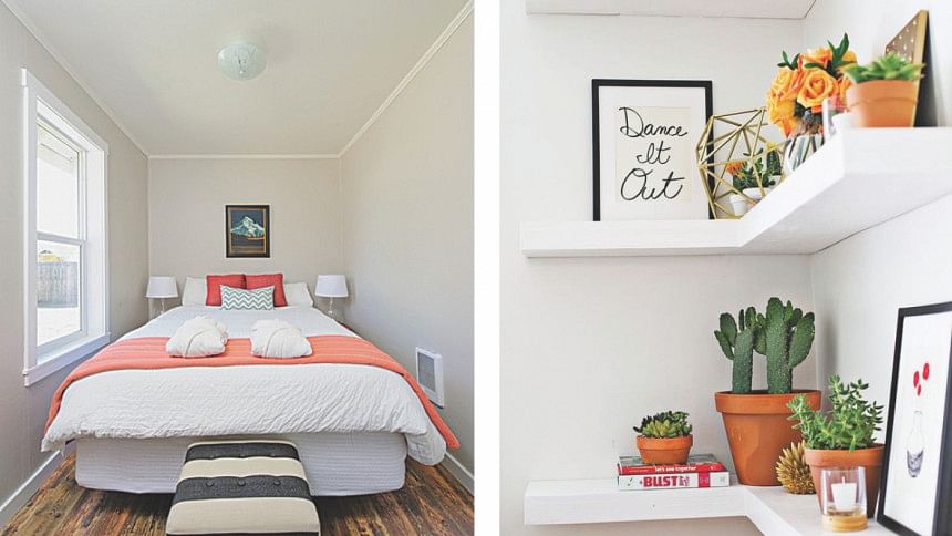
The color of your room is one of the biggest factors working behind how it looks. Choose the right one and it'll look beautiful. Pick a weird combination and it'll get on everyone's nerves. For tiny rooms that might feel stuffy to you, pick a color that's light and whitish. It makes the area look open and welcoming rather than congested.
Think shades and complements, not contrasts:
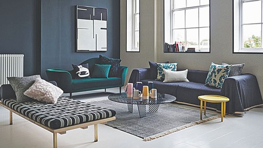
Contrary to popular belief, a contrasting look isn't always the right road to take. While opposites can grab your attention and look nice, they sometimes make a room ugly for the exact same reason. Use styles and colours that promote each other and flow smoothly. It's a safe bet and easier on the eyes to take it all in.
Space out or leave out:
No matter what, it's a big no to cramming a lot of furniture or small decoration pieces in a tiny space. If you can't space out the objects and create sufficient moving and breathing area in between, leave them out of the room. It makes the room seem wide open and gives out a welcoming look.

Decide on the focus of your room:
Similar to designing anything, the interior of your apartment shouldn't be pointless. If it's a living room, you want the focus to be on the sitting area; if it's a dining room, the dining table is the hero. Place them accordingly and make sure it's a planned flow and not just an abrupt addition in the middle of the room.
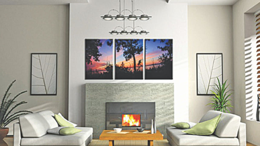
Hang artworks with the right frames, at the right place: Artworks can be amazing assets to any interior. But it depends on how you put them up and where. For example, if the room has a contemporary theme, a white wooden frame would look much better than a metallic one. Also, remember that a picture is a huge attention grabber, putting it in awkward places with other stuff on the wall might ruin the entire view. Hang them in triples or singles on wide plain walls and they'll look wonderful.

No empty corners:
To make your room look complete and give a satisfactory feel to it, fill up corners with small shelves containing short collections of books or maybe put in plants in small to medium sized vases. Either way, corners that are not empty, are pleasing to the eye. Don't miss this for your next interior design project.
When in doubt, keep it simple: Nothing beats simplicity when it comes to interior design. If there's not much to judge, there's not much to not like about a room. If you're confused about whether or not you should be adding all those souvenirs from Egypt you got last summer, try to sacrifice a lot and keep the room as simple as possible.

 For all latest news, follow The Daily Star's Google News channel.


Comments