Japanese suggest new Olympic logos

Since allegations of plagiarism have swirled around the Tokyo 2020 Olympic Games logo, Japanese social media users have been posting their own creative designs.
On Tuesday, the logo was scrapped, and suggestions such as ninjas and paper cranes as well as the hashtag "#unofficialemblem" in Japanese started being shared widely.
Return of the wreath
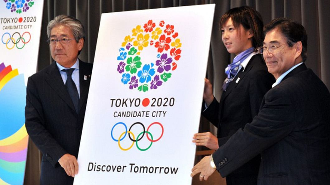
One particularly popular idea is for Tokyo to reuse the logo it had during its Olympic bid as a candidate city.
Created by design student Ai Shimamine, the logo depicts a wreath of cherry blossoms, one of Japan's most celebrated flowers.
It has a somewhat morbid origin - she said in an interview that she got the idea from a scene in an unnamed film where a wreath was laid on a grave.
But it was given a hopeful spin by the Olympic bid committee. The wreath -which symbolises a return - has two meanings in the logo, according to committee chief Masato Mizuno.
"It is the idea of 'coming back again'... the Olympic Games coming back to Tokyo and Japan coming back (from the Fukushima disaster)," he said in 2011. Tokyo last hosted the Games in 1964.

Fan art
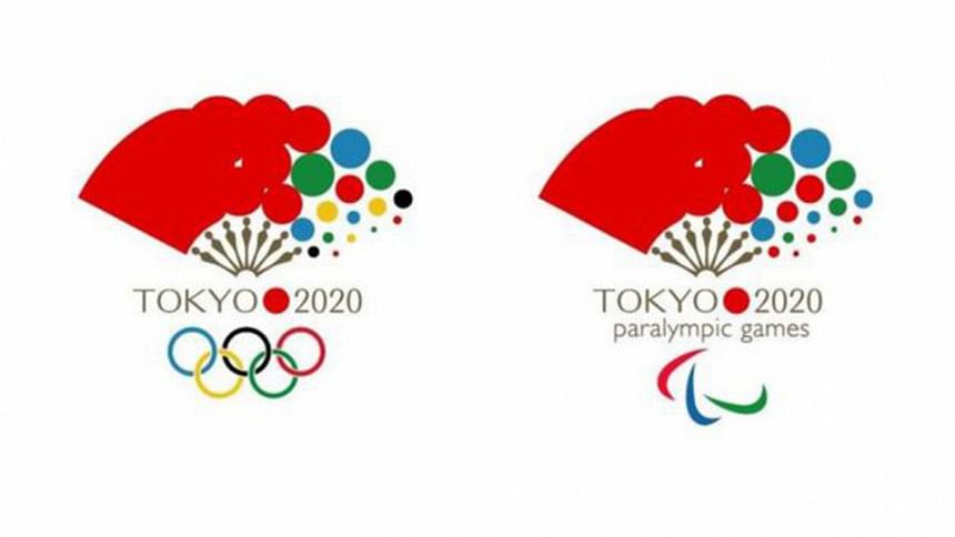
One of the idea being most widely shared on social media is a logo of a fan designed by illustrator Kan Kan.
The designer said the fan represented good luck and is traditionally used for cheering, adding: "With this fan I am expressing many people's support for Japan."
Sunrise
Twitter user Zanma1 said his design was a nod to Japan's moniker Land of the Rising Sun.
Ninja tactics
A tongue-in-cheek riff on a Japanese icon came from a band called The Ninja, whose design incorporates the star-shaped shuriken weapon.
Image copyright The Ninja
Taking flight
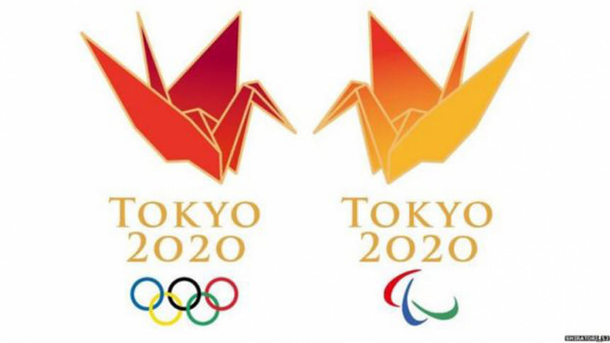
A popular motif is the paper crane, which represents peace and good luck in Japanese culture. It is usually given to people in hospital to wish them a speedy recovery, or placed at war memorials as a symbol of peace.
Twitter user Shiratori_52 said the Summer Games logo used a red colour symbolising passion and the Olympic flame's "holy fire", while the Paralympics logo's colour represented the bright future of disabled people.
Meanwhile Eiji Tamura took the opportunity to poke fun at the logo controversy with a design which he said he came up with within 10 minutes.
"Since the situation is such a mess, I've created my own. I've used origami cranes and cherry blossoms to symbolise people's hopes and so you can really feel the Japanese culture," he said on Twitter.
Controversy
The suggestions came almost immediately after Tokyo announced it was scrapping designer Kenjiro Sano's logo.
It was unveiled only last month, based around the letter T and a red circle representing a beating heart.
Sano said he did not plagiarise, but others have pointed out similarities with the logo for a Belgian theatre.


 For all latest news, follow The Daily Star's Google News channel.


Comments