Advertising overload in metro rail: a lesson for marketers

The newly inaugurated metro rail has become the canvas for a marketing strategy that teeters on the brink of visual overload. The pervasive spread of advertisements of a certain refrigerator brand, plastered over every conceivable surface within the metro's interiors, has sparked a debate on the essence of tasteful advertising in public transportation - a conversation the context of which extends far beyond the borders of Bangladesh.
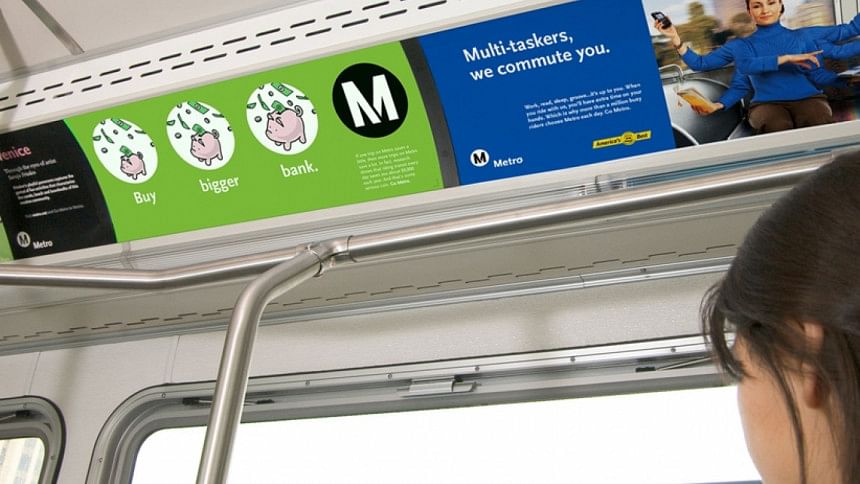
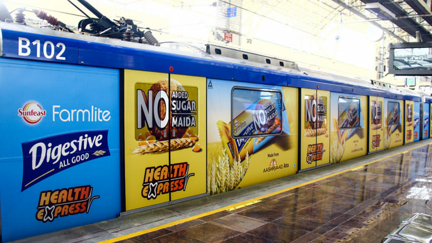
Globally, the practice of advertising in public transit systems like metros, buses, and trains is well-established. It ranges from the subtle to the sublime, encompassing a variety of forms - from backlit dioramas and wall posters to exterior car wraps and interior car cards. Each format, when used judiciously, has the potential to transform a mundane commute into a dynamic interface between the public and the brands seeking their attention.

However, in the case of Dhaka's metro, the approach has been markedly different. The interior of the metro rail cars, now a mosaic of repetitive advertising, raises questions about the impact of such an overwhelming marketing strategy on the commuter's experience. Notably, this is reminiscent of the once popular, now less so, 'station domination' tactic, where a single advertiser monopolises every advertising space in a transit hub.
While undoubtedly bold, this approach is often a double-edged sword - it can garner attention but at the risk of saturating and potentially alienating the audience. The art of advertising in such public spaces lies in striking a balance - a harmony between visibility and aesthetic appeal. It's about enhancing the passenger's journey, not hindering it with a barrage of marketing messages. The effectiveness of transit advertising hinges on its ability to engage the audience in a way that is cohesive with their environment. This calls for creativity, subtlety, and a keen understanding of the audience's mindset.

The Dhaka metro's current advertising landscape, unfortunately, seems to have bypassed these nuances. The overwhelming visual clutter not only detracts from the passenger experience but also risks diluting the impact of the advertisements themselves. The key is not just in what is being shown, but how it is being presented. Advertisers and transit authorities alike must tread carefully, ensuring that their marketing efforts enrich, rather than encroach upon, the public space.
Drawing on successful global practices, it's evident that there's a need for a more refined approach in Dhaka's metro advertising. This involves considering the aesthetics of the space, the commuter's experience, and the seamless integration of advertising content within the transit environment. Such an approach respects the commuter's journey, turning it into an opportunity for positive engagement rather than an overwhelming onslaught of marketing material.
Dhaka's metro rail presents a unique opportunity - to set a precedent for tasteful, effective advertising in public transit systems, not just within Bangladesh, but as a case study for the world. The goal should be to create an advertising environment that is not just seen but appreciated, where marketing coexists harmoniously with the rhythm of daily commutes. After all, in the world of advertising, less is often more, and subtlety can speak volumes.

 For all latest news, follow The Daily Star's Google News channel.


Comments