Are cars getting uglier?

I remember the first time I saw a Toyota Altezza, export models labeled IS200/300 with a Lexus badge, quite clearly. The year was 2003 and the early years of a car culture dominated by hideous bodykits and garish spoilers on Toyota Corollas and Corsas culminated in the F1 auto show, held on the Gulshan Youth Club grounds. Among the loud and obnoxious "modified" family sedans, 11 year old me spied a gorgeously raked, impossibly handsome and taut shape. It stood out without trying too hard, with the right balance of elegance and sportiness.
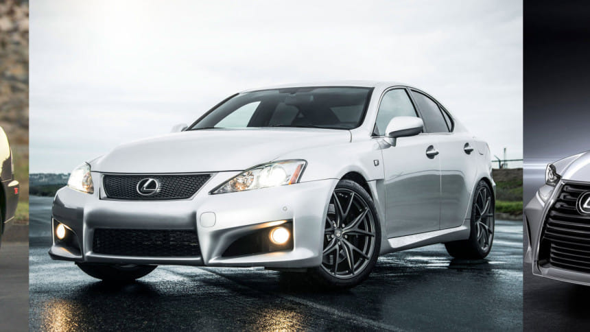
The first generation Altezza/IS is still handsome and modern even today. When the second generation came out, it was designed for the European and American markets as a clear contender to the German throne dominated by BMW, Mercedes and Audi. It was sleek, fundamentally sound in design and function, and the world loved the IS-F's aggressiveness. It was bold, and for the Japanese, quite revolutionary in the way it aimed squarely at the BMW M3, Benz C63 AMG, Audi RS4 and actually survived.
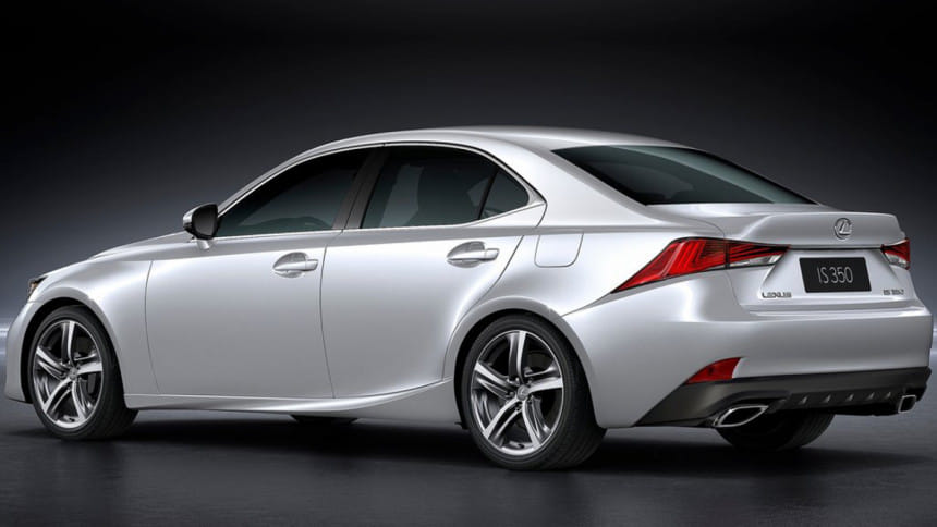
In 2013, the Lexus IS was yet again revised in terms of styling, progressive thinking by the design team yielding a hyper modern, alien-spaceship influenced front and rear. The front had a radical new hourglass grille and the headlights were slashes of crystal, the Daytime Running Lights separated from the headlights and serving as a separate attraction. At the rear, the taillights seemed to have melted under all the pressure of competing with Germans in the luxury car market. It was all very messy, but apparently it sold well.

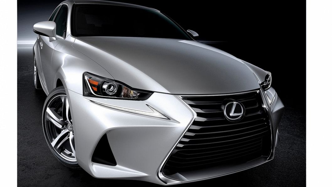
Now, in 2016, Lexus has brought out a monstrosity they are calling the new IS, which, apart from a new front end, looks exactly the same as the previous gen. Unveiled at the Beijing Auto Show, where the design of the fourth generation IS goes horribly wrong is at the front, which has no semblance of flow, very little coherence and no discernible anchor points to which the different elements gravitate towards. The bumper cutouts are droopy and seem to want to get away from that hideous grille, jutting sideways and outward, leaving a wide expanse between the headlight and the front edge of the bumper. The designers attempted to cover up this pointless exercise with a set of slim DRLs but that surface might as well serve as a runway for Airbus' new range of widebody planes, the A350 XWB.
"The new grille folds back at a higher point, changing its top and bottom proportions that enhance its sporty feel with a visually lower center of gravity, while blending effortlessly into the reshaped hood", spouts the official Lexus PR machine, attempting to cover up the fact that the new IS front has the sleekness of a 1960's Bedford truck.
There is no doubt that the IS will sell well in certain parts of the world. It represents the flashy attitudes of post 2010 teens and tweens, and when it's time for their families to get a car, opinions will be swayed and wallets will be cracked open. Like the music industry's dive into the depths of mediocrity in recent years, automotive designers have stopped listening to the beat of the consumers and started enforcing a beat of their own. Automotive design, pure and true, is certainly on its way to the grave, then. At least at Lexus it is.


 For all latest news, follow The Daily Star's Google News channel.


Comments