Daily Star Books
INTERVIEW

‘Books must make you see things differently': Sunandini Banerjee of Seagull Books on the art of book cover design
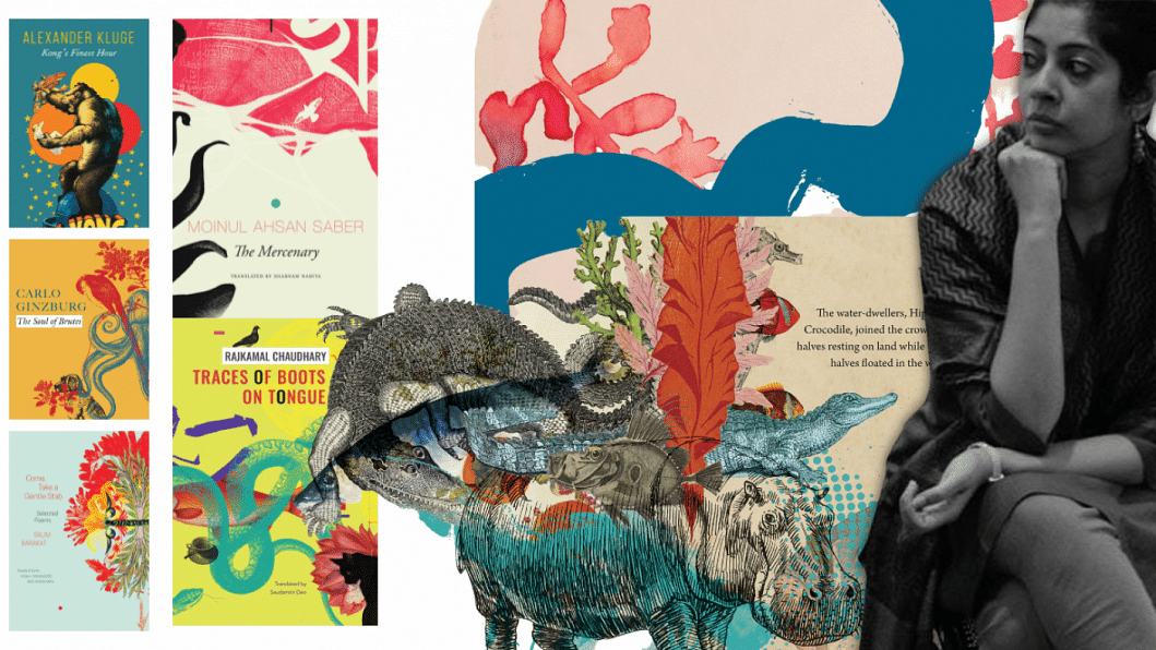
Sunandini Banerjee, editor and artist at Seagull Books Kolkata, discusses her inspirations, challenges, and journey through book cover design.
Illustrations: Sunandini Banerjee Collage: Sarah Anjum Bari

You have studied literature. Why and how did you get into illustration and book design? 

I am indeed an English Literature student from Jadavpur University, Kolkata. While I was studying for my final Master's examinations, I happened to be informed of a vacancy at Seagull Books—an editorial assistant was wanted. When I applied, and then joined Seagull Books in 2000, I brought along with me an entire lifetime of reading, as well as my literature degree, but absolutely no training in any kind of graphic design. 
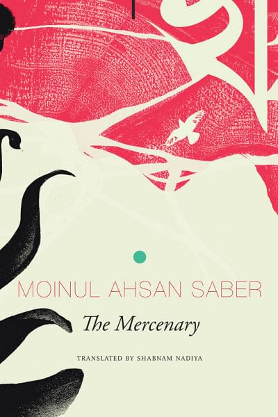
In those days, we couldn't even afford to have a computer at home. My first few years at Seagull Books were spent doing an assortment of editorial tasks on a vast variety of books—cultural studies titles, playscripts, translations from the Bangla into English, issues of the Seagull Theatre Quarterly, books on cinema and performance studies. I worked on whatever was given to me, and went from proofreading to copy-editing and, slowly, to typesetting and designing pages. The covers, until then, used to be designed by our publisher, Naveen Kishore, also a self-taught designer. 

I used to watch him design them, and in time began to sometimes give him ideas—such as suggesting a photograph or an image—for his next cover, especially if it was for a book I'd edited, because then I knew the content very well. Naveen had to travel quite a bit, and once, as he was leaving the office, I asked with what I now put down to the recklessness of youth: "Can I design a cover?" And Naveen, with the infinite wisdom and patience of seniority, and with no insecurities whatsoever, replied: "Sure. Why not?" And finally, the images in my head could walk out into the world.
You see, alongside my love for words, I had a deep, deep love for images. For colour and shape and size and form. For straight lines and curves. For the interaction of text and picture and empty space that together make up a page. Or a cover. Sadly, not being able to draw or paint in real life meant that this passion stayed locked inside me. I could write or read or translate to engage with my love for language. But my love for images, for text and image together—that had no outlet. Until I landed up at Seagull Books, a publishing house that not only edits but also designs all its books and covers in-house. A publishing house that never tells its editors: "You must only edit because that's your job. You can't design." I was interested. I expressed that interest. And it was encouraged and nurtured. I have always admired design. And slowly, through the books and covers I worked on, I taught myself to work with image and text and space. Now I both edit and design. And I must admit I'm having the time of my life.

What are the things you keep in mind while designing a fiction or nonfiction book? What is your philosophy behind book designing? 

The process of designing a book is a combination of the practical and the creative. The first consideration is: What kind of book is it? Picture book? Novel? Literary fiction or pulp fiction? If fiction, then what kind? Romance, YA, crime, historical, mythological, sci-fi . . . If it's nonfiction, then what kind? For the general reader? Or for the academic market? Does the book have pictures? Will it be printed in black and white, or in colour? Is it a coffee-table book? 

One always, always begins from the content, and with it: the segment of the market it's meant for. Because that helps determine shape, page length, and most importantly, price. One can design a book in full colour and create the most glorious object, but then it may be so expensive that it will be priced out of its shelf in the market. Once we have this in mind, then begins the creative process. 

What kind of cover? What kind of paper? How wide are the margins? What kind of page ornamentation, if any? Which typeface? How elaborate the space between the lines, or not? Where do the Notes appear? How large or small are they? 
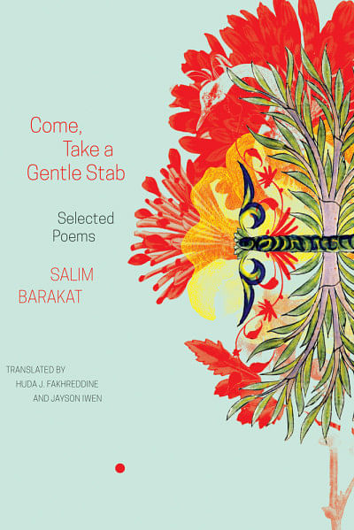
Of course, I must mention here that there have often been times when we have thrown caution to the winds and been so moved by the content that a most wondrous book has emerged that perhaps makes no economic sense but that remains on the shelves as a radical re-imagination of both that content and of publishing itself. Books must make you see things differently. Sometimes that includes the idea of what or how a book should be. Often, one chooses to follow the rules. Sometimes, one chooses to cast them aside.

I would like to know the story behind Ngũgĩ wa Thiong'o's The Upright Revolution, a recent work of yours. 

The Upright Revolution (2019) is a wonderful fable written by one of the world's greatest living writers about how human beings gradually stopped crawling on all fours, and the limbs stopped competing with each other for primacy and chose to listen to the head instead. A head which counselled them that instead of working separately and against one another, they should work together. That way they could achieve many things. 
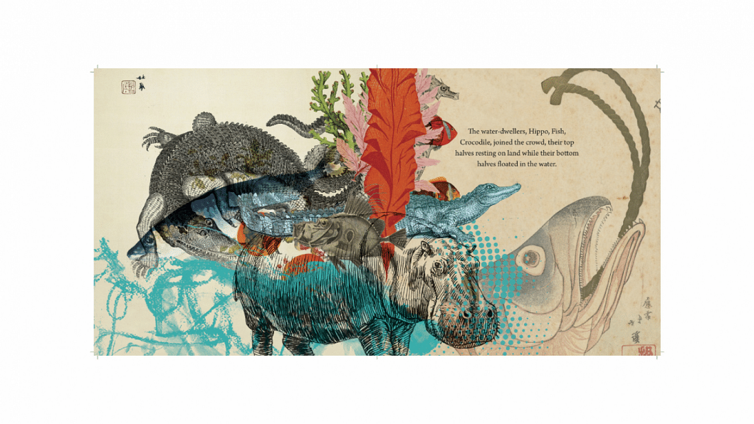
When I illustrated the fable, I chose to focus first on the emotions felt by the various body parts as they jostled for supremacy, I chose to focus on the glorious abundance of animal and bird and fish life that there is, and towards the end, when the human body is finally upright and manages to work and starts to build the world, I chose to interpret that through images of women working, women toiling, women in sports and science. I chose to focus on female labour that, in truth, in both visible and mainly invisible ways, has been making the world go round. Not only the extraordinary women, but the 'ordinary' ones too. 
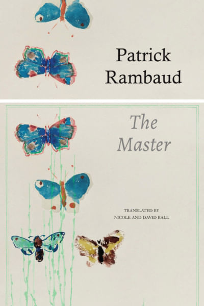
The images are drawn from all over the world. It is a universal fable. I have also chosen to end it with a focus on women—surely, at least half of the world as we know it. No? The author was very, very pleased and that for me was my greatest reward. It is his fable. But his wide open heart let me also make it mine, at least a little.

Many of Seagull Books' covers are illustrated with different typographies, animals, plants, trees, flowers and so on. Is this kind of—if we can term it so—collage a conscious design choice? 

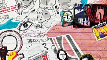
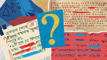
You absolutely may term them collages—I insist that you do. My form of artistic expression and outpouring is the digital collage. I choose and cut and paste and add layer upon layer of images to either present you with a collection, or one single image comprised of many 'found' bits and pieces. I say 'found' because I can't draw, so I locate them from various sources. 

The form of the collage is linked to two things—the fact that sometimes a word, a title, a phrase, a sentence gives rise to many images in my mind, both from the book itself as well as from the world outside, pulling in associations with other books, lines of poetry, songs, my likes and dislikes, the tone and style of the text before me. 
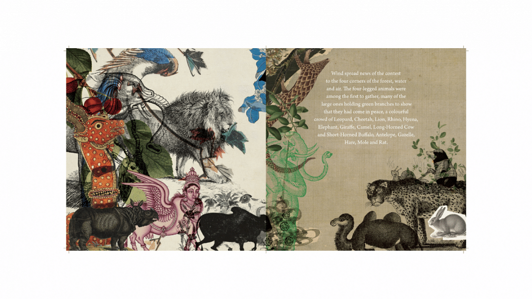
The second: all texts are layered. They carry within them part of the author, part of the translator, the land in which they were written, the time, the characters, shades of emotion . . . What is written is only half the story. What is not written is often just as important. Hence, my collages, which try and represent those manifold layers, the different shifts and registers and motifs that together make up the whole. It is a conscious design choice, yes. It is the form that has endless possibilities and that I find very exciting. 

These days, though, I am trying to balance it with other styles so as not to dwell in a 'comfort zone'. But yes, I do 'think' in collages. We live in a world where images rush at us from all sides. It is often hard to choose just one. The collage allows me to hold many of those images together, to realise that every fragment is important. And has room on the page.

How do you search for ideas and inspirations? 

I read a lot. The more words there are in you, the more voices you read and absorb, the better you are at imagining, at putting yourself into a story so that you are able to walk out with a fistful of it which you can then turn into a cover.
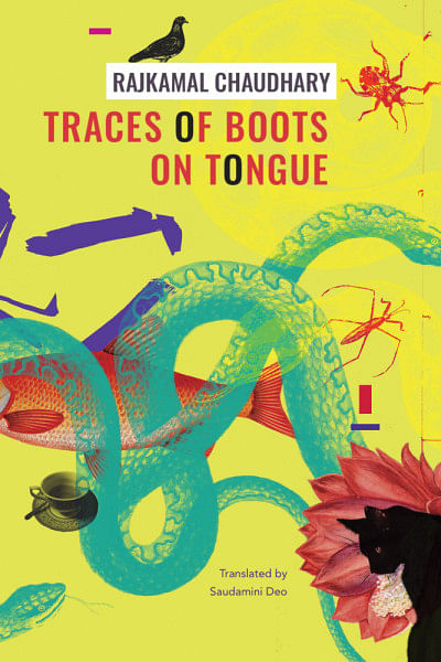
I look at colour—at the market, on the fruits and vegetables, on people's clothes and shoes and bags and jewellery, I look at texture and patterns. I look at a lot of art and photos on Instagram. I visit bookshops. When I travel, I visit museums. 

And always, always, I look at nature. The most astonishing patterns and colours and textures and symmetries abound around us for free. We only have to look. And, when the time comes, we must remember.

There are a lot of empty spaces in the books you design. Is there a specific reason for using such spaces?
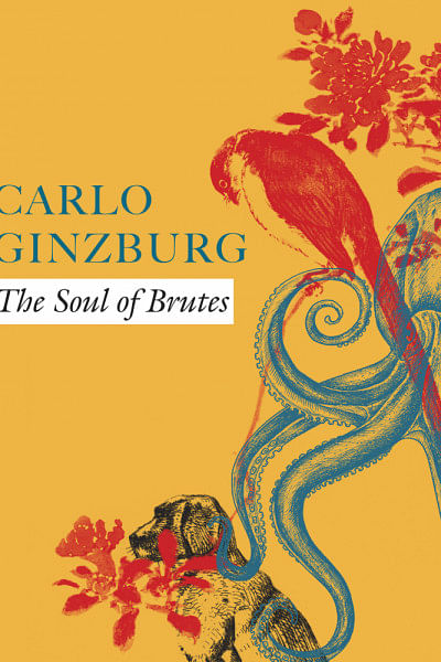
Empty spaces are vital to convey pauses, breaks, shifts in the story. They let the story breathe. They let the page breathe. They let the reader rest. The margins on the outer edges of a page hold the story within it, giving it a nest. They are vital. Space between the lines lets the eye travel comfortably and not slip from the line above to the line below. Empty spaces are emphasis, eloquent, climactic, interludes, full of silence . . . empty spaces are as vital as the text or image in a book. Both black and white together form a printed page. Also, are empty spaces really empty? We do not think so at all.

You are a renowned expert in the world of book design. Can you please share your top 3 or 4 tips for young cover designers in the Indian subcontinent to consider when working on their books? 

One: to read as much as possible, in whichever language they prefer, in order to be able to understand and interpret a variety of voices and subjects. 

Two: to use the internet intelligently, to look at art, books and book covers, images, read blogs, visit publisher websites across the world, to build both inspiration and an image library. 
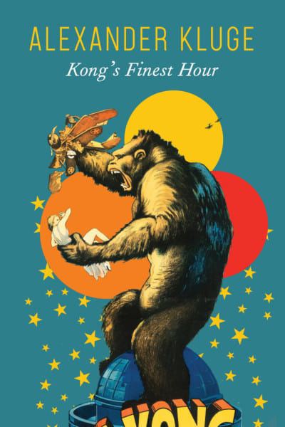
Three: to remember that the design is always in service to the book's content. 

Four: to be able to design for any kind of book, no matter whether they like it or not. 

Five: to always bear in mind that a good cover design comprises both image and text, and not only a striking image. 

Six: the back cover, the spine, the flaps on a jacket, these are part of the cover too and need to be thought about.

Ananta Yusuf is a journalist at The Daily Star. 

 

Comments

INTERVIEW

‘Books must make you see things differently': Sunandini Banerjee of Seagull Books on the art of book cover design

Sunandini Banerjee, editor and artist at Seagull Books Kolkata, discusses her inspirations, challenges, and journey through book cover design.
Illustrations: Sunandini Banerjee Collage: Sarah Anjum Bari

You have studied literature. Why and how did you get into illustration and book design? 

I am indeed an English Literature student from Jadavpur University, Kolkata. While I was studying for my final Master's examinations, I happened to be informed of a vacancy at Seagull Books—an editorial assistant was wanted. When I applied, and then joined Seagull Books in 2000, I brought along with me an entire lifetime of reading, as well as my literature degree, but absolutely no training in any kind of graphic design. 

In those days, we couldn't even afford to have a computer at home. My first few years at Seagull Books were spent doing an assortment of editorial tasks on a vast variety of books—cultural studies titles, playscripts, translations from the Bangla into English, issues of the Seagull Theatre Quarterly, books on cinema and performance studies. I worked on whatever was given to me, and went from proofreading to copy-editing and, slowly, to typesetting and designing pages. The covers, until then, used to be designed by our publisher, Naveen Kishore, also a self-taught designer. 

I used to watch him design them, and in time began to sometimes give him ideas—such as suggesting a photograph or an image—for his next cover, especially if it was for a book I'd edited, because then I knew the content very well. Naveen had to travel quite a bit, and once, as he was leaving the office, I asked with what I now put down to the recklessness of youth: "Can I design a cover?" And Naveen, with the infinite wisdom and patience of seniority, and with no insecurities whatsoever, replied: "Sure. Why not?" And finally, the images in my head could walk out into the world.

You see, alongside my love for words, I had a deep, deep love for images. For colour and shape and size and form. For straight lines and curves. For the interaction of text and picture and empty space that together make up a page. Or a cover. Sadly, not being able to draw or paint in real life meant that this passion stayed locked inside me. I could write or read or translate to engage with my love for language. But my love for images, for text and image together—that had no outlet. Until I landed up at Seagull Books, a publishing house that not only edits but also designs all its books and covers in-house. A publishing house that never tells its editors: "You must only edit because that's your job. You can't design." I was interested. I expressed that interest. And it was encouraged and nurtured. I have always admired design. And slowly, through the books and covers I worked on, I taught myself to work with image and text and space. Now I both edit and design. And I must admit I'm having the time of my life.

What are the things you keep in mind while designing a fiction or nonfiction book? What is your philosophy behind book designing? 

The process of designing a book is a combination of the practical and the creative. The first consideration is: What kind of book is it? Picture book? Novel? Literary fiction or pulp fiction? If fiction, then what kind? Romance, YA, crime, historical, mythological, sci-fi . . . If it's nonfiction, then what kind? For the general reader? Or for the academic market? Does the book have pictures? Will it be printed in black and white, or in colour? Is it a coffee-table book? 

One always, always begins from the content, and with it: the segment of the market it's meant for. Because that helps determine shape, page length, and most importantly, price. One can design a book in full colour and create the most glorious object, but then it may be so expensive that it will be priced out of its shelf in the market. Once we have this in mind, then begins the creative process. 

What kind of cover? What kind of paper? How wide are the margins? What kind of page ornamentation, if any? Which typeface? How elaborate the space between the lines, or not? Where do the Notes appear? How large or small are they? 

Of course, I must mention here that there have often been times when we have thrown caution to the winds and been so moved by the content that a most wondrous book has emerged that perhaps makes no economic sense but that remains on the shelves as a radical re-imagination of both that content and of publishing itself. Books must make you see things differently. Sometimes that includes the idea of what or how a book should be. Often, one chooses to follow the rules. Sometimes, one chooses to cast them aside.

I would like to know the story behind Ngũgĩ wa Thiong'o's The Upright Revolution, a recent work of yours. 

The Upright Revolution (2019) is a wonderful fable written by one of the world's greatest living writers about how human beings gradually stopped crawling on all fours, and the limbs stopped competing with each other for primacy and chose to listen to the head instead. A head which counselled them that instead of working separately and against one another, they should work together. That way they could achieve many things. 

When I illustrated the fable, I chose to focus first on the emotions felt by the various body parts as they jostled for supremacy, I chose to focus on the glorious abundance of animal and bird and fish life that there is, and towards the end, when the human body is finally upright and manages to work and starts to build the world, I chose to interpret that through images of women working, women toiling, women in sports and science. I chose to focus on female labour that, in truth, in both visible and mainly invisible ways, has been making the world go round. Not only the extraordinary women, but the 'ordinary' ones too. 

The images are drawn from all over the world. It is a universal fable. I have also chosen to end it with a focus on women—surely, at least half of the world as we know it. No? The author was very, very pleased and that for me was my greatest reward. It is his fable. But his wide open heart let me also make it mine, at least a little.

Many of Seagull Books' covers are illustrated with different typographies, animals, plants, trees, flowers and so on. Is this kind of—if we can term it so—collage a conscious design choice? 

You absolutely may term them collages—I insist that you do. My form of artistic expression and outpouring is the digital collage. I choose and cut and paste and add layer upon layer of images to either present you with a collection, or one single image comprised of many 'found' bits and pieces. I say 'found' because I can't draw, so I locate them from various sources. 

The form of the collage is linked to two things—the fact that sometimes a word, a title, a phrase, a sentence gives rise to many images in my mind, both from the book itself as well as from the world outside, pulling in associations with other books, lines of poetry, songs, my likes and dislikes, the tone and style of the text before me. 

The second: all texts are layered. They carry within them part of the author, part of the translator, the land in which they were written, the time, the characters, shades of emotion . . . What is written is only half the story. What is not written is often just as important. Hence, my collages, which try and represent those manifold layers, the different shifts and registers and motifs that together make up the whole. It is a conscious design choice, yes. It is the form that has endless possibilities and that I find very exciting. 

These days, though, I am trying to balance it with other styles so as not to dwell in a 'comfort zone'. But yes, I do 'think' in collages. We live in a world where images rush at us from all sides. It is often hard to choose just one. The collage allows me to hold many of those images together, to realise that every fragment is important. And has room on the page.

How do you search for ideas and inspirations? 

I read a lot. The more words there are in you, the more voices you read and absorb, the better you are at imagining, at putting yourself into a story so that you are able to walk out with a fistful of it which you can then turn into a cover.

I look at colour—at the market, on the fruits and vegetables, on people's clothes and shoes and bags and jewellery, I look at texture and patterns. I look at a lot of art and photos on Instagram. I visit bookshops. When I travel, I visit museums. 

And always, always, I look at nature. The most astonishing patterns and colours and textures and symmetries abound around us for free. We only have to look. And, when the time comes, we must remember.

There are a lot of empty spaces in the books you design. Is there a specific reason for using such spaces?

Empty spaces are vital to convey pauses, breaks, shifts in the story. They let the story breathe. They let the page breathe. They let the reader rest. The margins on the outer edges of a page hold the story within it, giving it a nest. They are vital. Space between the lines lets the eye travel comfortably and not slip from the line above to the line below. Empty spaces are emphasis, eloquent, climactic, interludes, full of silence . . . empty spaces are as vital as the text or image in a book. Both black and white together form a printed page. Also, are empty spaces really empty? We do not think so at all.

You are a renowned expert in the world of book design. Can you please share your top 3 or 4 tips for young cover designers in the Indian subcontinent to consider when working on their books? 

One: to read as much as possible, in whichever language they prefer, in order to be able to understand and interpret a variety of voices and subjects. 

Two: to use the internet intelligently, to look at art, books and book covers, images, read blogs, visit publisher websites across the world, to build both inspiration and an image library. 

Three: to remember that the design is always in service to the book's content. 

Four: to be able to design for any kind of book, no matter whether they like it or not. 

Five: to always bear in mind that a good cover design comprises both image and text, and not only a striking image. 

Six: the back cover, the spine, the flaps on a jacket, these are part of the cover too and need to be thought about.

Ananta Yusuf is a journalist at The Daily Star. 


Comments

ফ্যাসিস্টরা যেন সংসদে আসন নিতে না পারে সেই সুপারিশ করেছি: বদিউল আলম মজুমদার

আজ শনিবার দুপুরে কুমিল্লার কোটবাড়ীতে বাংলাদেশ পল্লী উন্নয়ন একাডেমিতে অনুষ্ঠিত এক সেমিনার শেষে সাংবাদিকদের এসব কথা বলেন নির্বাচনব্যবস্থা সংস্কার কমিশনের প্রধান।

৩ ঘণ্টা আগে